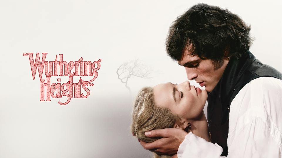
A Re-imagined Adaptation That Many of Us Were Looking Forward to, but Did it Live Up to the Hype?
This month, Emerald Fennell’s film “Wuthering Heights” has consumed social media, obtaining a bag of mixed reviews and reactions to certain scenes and plot points. Derived from the literary classic written in 1847 by Emily Brontë, “Wuthering Heights” proved itself to be a much-anticipated re-imagining of the initial telling, using its A-list stars such as Margot Robbie and Jacob Elordi, and the film’s prevalent sexual subject matter as key marketing strategies ahead of its release. Although many people have enjoyed the film, others have not. My analysis of “Wuthering Heights” will not focus on the adaptation process because 1. I haven’t read the book yet so this would be an unbalanced judgement, and 2. the use of quotation marks around the film’s title shows that Fennell never intended for this to be a true retelling of the initial story. Despite this, there are some aspects of the film that I don’t believe work well given the rough time period the film is set in.
Costume
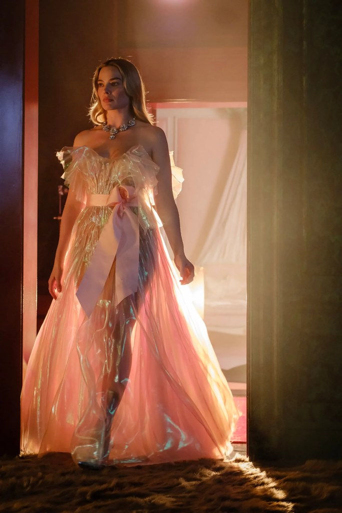
I personally found much of the costuming within the film inconsistent; some pieces I liked and thought worked well for the characters and their surrounding themes, but others I thought missed the mark. In a promotional video released before the film debuted, Emerald Fennell remarked “The first thing is not to pin it to any very specific time”. It’s true that a specific date or century is never mentioned within the film, however, a rough time period can be situated due to the representation of class divide and how many of the more urban settings look. I think it’s fair to say that the film is set no later than the mid-late 1800s based on much of the mise-en-scène.
I felt that some of the costumes worked, particularly Cathy’s long, billowy wedding dress, and some of her corseted gowns, too. They really suited the tone of the film and played into the gothic fiction and period drama sub-genres of the film. However, some of the costumes practically did not make any sense to me and held no place in a film set when it is. My key examples of this are Cathy’s pink evening-gown style dress with pink, translucent synthetic material that she wears on her wedding night. I felt that the materials used for this dress were anachronistic; Isabella also wears a dress very similar to this and it made me wonder where they were getting these materials from? Although Edgar is incredibly rich and could probably buy these materials if he wished, especially for his wife who he is clearly smitten with, synthetic materials were not invented until the very end of the 19th century. This is why, for me, it doesn’t work writing a film that is atemporal but holds many tropes that are common of one particular era.
In this same promotional video, the film’s costume designer, Jaqueline Durran, states “They’re not really period costumes” – why not when one of the sub-genres of “Wuthering Heights” is period drama? – and goes on to say that the costumes are “an imagined version of a period costume”. This doesn’t make much sense to me; one of the defining factors of a period drama (which “Wuthering Heights” uses many codes and conventions from) is costume, so why does the costuming have to be “imagined” when it can just be? The dominant themes of love, desire and social class are also commonly found in the period drama, so it would be hard to deny that this film is not partly made up from this sub-genre. Perhaps not labelling “Wuthering Heights” as a film of any particular genre is an excuse as to why many of the costuming decisions have been made. For some audiences, this might work, but for me it unfortunately doesn’t.
Set Design
Another aspect of “Wuthering Heights” that stuck out for me was the set design, which, again, I have mixed feelings about. Many of the settings are stunning and really capture the film’s overarching themes, such as the harsh weather conditions of The Moors symbolising Cathy and Heathcliff’s tumultuous relationship, and the optimism for blue skies mirroring the hope that they will end up together and everything will seem right. I also found Heathcliff’s room at Wuthering Heights engrossing; its dirty, cold nature emulates the way Earnshaw always viewed him. Although on the surface Earnshaw showed his intention to take Heathcliff in as an act of kindness, he was given a small, dark room above the stables to live in, insinuating that he viewed him as sub-human due to his lack of money and inability to read and communicate at first. When he first brings him home, Earnshaw and Cathy even agree that Heathcliff will live with them as her “pet”, further solidifying the idea that Heathcliff is animalistic, which can also be noted by his sexual vigor displayed throughout the film.
I have mixed opinions about Edgar’s house, in that I think a lot of the design decisions have, again, been made with impact in mind over accuracy. For me, this works sometimes but isn’t always executed well enough for the impact to outweigh the historical (in)accuracy. For example, the use of Cathy’s skin colour, veins, and moles on her bedroom wall is unconventional but the symbolism is clear. Her skin has been desired by multiple people throughout the film, and this imagery ties in with the primary themes of desire and sexuality. However, in another room the walls are covered in some sort of shiny silver foil – I assume to highlight Edgar’s wealth. Given the presumed period of the film, this did not make any sense to me and didn’t add anything thematically, so I felt that I was taken out of the immersion and was reminded that I was in fact watching a modern take on a literary classic. Compared to the way I felt immersed in the film during the scenes set on The Moors, this disappointed me, as it felt like a cheap way of showing wealth and nothing more.
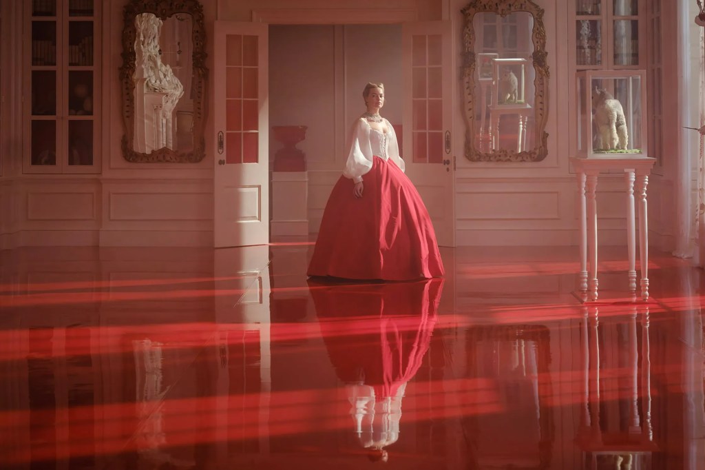
Some scenes sit in the middle of these examples; they are impactful but logistically don’t make much sense. One room in the house has a completely red shiny floor, used to foreshadow Cathy’s death and how she’s “gonna die in this house”. I loved this symbolism but also questioned how that was even possible to achieve in that age (and how did they keep it so shiny if it is being walked on in heels every day?!). In other rooms, audiences can see heads with strings of beads coming out of their mouths, and a fireplace made up of hands leading up the mantlepiece. Although these images are unconventional in a 19th century stately home, they simply represent the sexual themes found throughout the film. The subtly of these set design aspects heighten their impact for me, as they are there to be noticed and to support the film’s overarching themes, but are not the main focus of their respective scenes.
Colour
My final component of “Wuthering Heights” that I found intrinsic to the film neatly ties my previous points together, and that’s colour. It would be impossible to deny that the use of red throughout the film embodies a range of emotions and themes that are integral to the plot. Cathy wears red throughout much of the film, even when we first meet her as a child, foreshadowing her eventual death as well as the way her whole life is consumed by the love and desire she feels for Heathcliff. By wearing red in her childhood, Fennell is letting the audience know that Cathy was always doomed and she never stood a chance at surviving. Cathy wearing red on the outside also forewarns of how pale and sicky she looks in her final scene, once she has passed away and the leeches have sucked out a lot of her blood to try and help her get better. The red ribbon tied into her hair in some earlier scenes also shows her entanglement in love, desire and ultimate tragedy. These emotions symbolised by the colour red have been literally tied into her anatomy to show that she would never have been able to escape and they were always what were going to kill her.
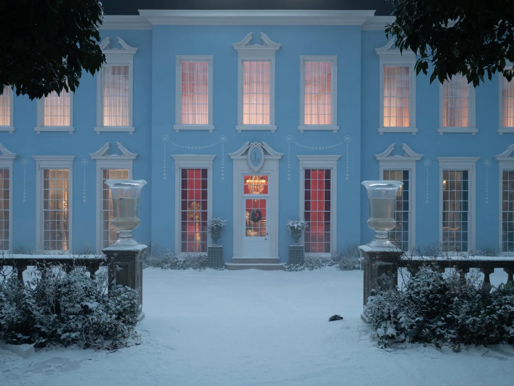
On top of this, lots of the rooms in Edgar’s house display extravagant colours that indicate how different characters are feeling and react to certain circumstances. For example, when Edgar finds out about Cathy and Heathcliff’s affair, he is wearing green, signifying his feelings of jealousy and envy. He also sleeps in a completely green bedroom, showing he is enveloped in this jealousy. Also, the outside of Edgar’s house is completely blue, indicating that Cathy is engulfed in sadness when she is inside the house. The shade of blue is light and cheerful, implying that this is often not a heavy feeling of sadness, as we do see Cathy smile, laugh and play games with Isabella within that house, but those feelings are always at least at the back of her mind. Eventually, these feelings of sadness become so prevalent that Cathy can’t hide them anymore and they become a significant aspect of her personality. Whilst living in the blue house, Cathy can’t escape these feelings of melancholy, grief and longing. In another interview, Fennell stated that “Me and Linus [Sandgren] really like to make movies that you could understand emotionally with the sound off”, and I think this has been achieved wonderfully through the use of colour in this film. Even though I have taken issue with certain aspects of the costuming and set design, I found the use of colour throughout “Wuthering Heights” completely compelling.
Overall, I wouldn’t say I loved “Wuthering Heights”. There are many aspects of the film that I think have been executed perfectly, but many others miss the mark for me. For a film so highly-anticipated, I was expecting more. Despite this, I did enjoy the overall narrative and am definitely going to read the book to indulge more in the diegesis.
Close Up Capture Rating: 2/5

Leave a comment